Our own attorney needed a site that says nothing a lawyer could not stand behind, in both of the languages his clients read. We wrote it around the situations companies call a lawyer in, set it in Bulgarian letterforms, and built an enquiry desk behind it to keep the page's plainest promise: a reply within one working day.
100
Lighthouse accessibility, bg & en
7.3:1
body-text contrast on navy
17
letters drawn the Bulgarian way
0
third-party requests on a visit
Sector
Legal services · Landing page & enquiry desk
Location
Sofia, Bulgaria
Duration
1 week to v1 · ongoing
Engagement
Custom Platform
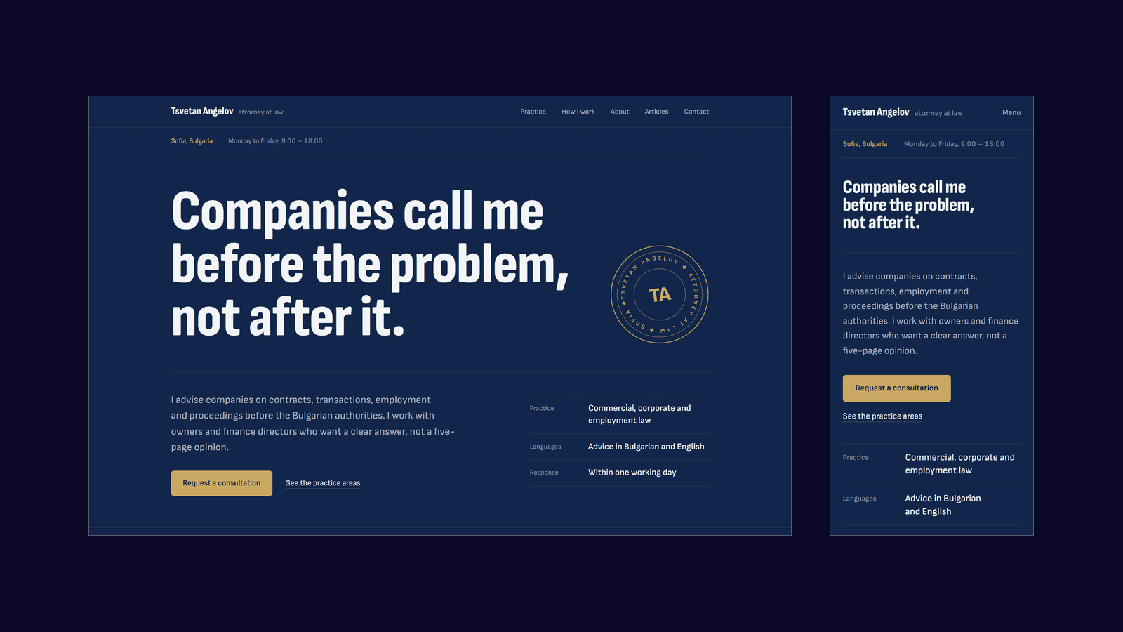
The English page as built: the statement set as the opening line of a letter, the seal beside it, and the same page on a phone.Home · en
Listen to this case study
0:00 / 12:42
Narrated by A I from the text of this page
Spread 01
A brief from across the desk.
Tsvetan Angelov is a Sofia attorney who acts for companies: the contracts they sign, the people they hire and part with, the businesses they buy and sell, the tax audits and the disputes. He is also our own lawyer, which made this an unusual brief. For once, we knew the client's work from the client's side of the desk.
The site has one job: explain what he does to the people who hire a business lawyer, and put a clear enquiry in his inbox. Those people are owners, managers, finance and HR leads, and foreign owners setting up in Bulgaria. Bulgarian comes first and English second, and both are complete. There is no newsletter and no team page — nothing that is not the practice or the way into it.
It also had to be lawful, which for a lawyer is narrower than it sounds. Until February 2026, Bulgaria's Bar Act did not allow attorneys to advertise. The amended Article 42 that now allows it also sets limits. Among them, an advertisement may not mislead, compare the lawyer with others on anything but objective grounds, disclose clients or their cases without their express written consent, or raise unjustified expectations of a result that does not depend on the lawyer alone.
Read as a brief, that list rules out most of what a services page is made of. No testimonials, which need each client's express written consent. No case results, which would need the same consent and could raise exactly the expectation the Act forbids. No “leading” anything, because there is nothing objective to compare. What is left is what he does, how he works and how to reach him, which is what a company looking for a lawyer came to find out anyway.
Spread 02
Indexed by situation.
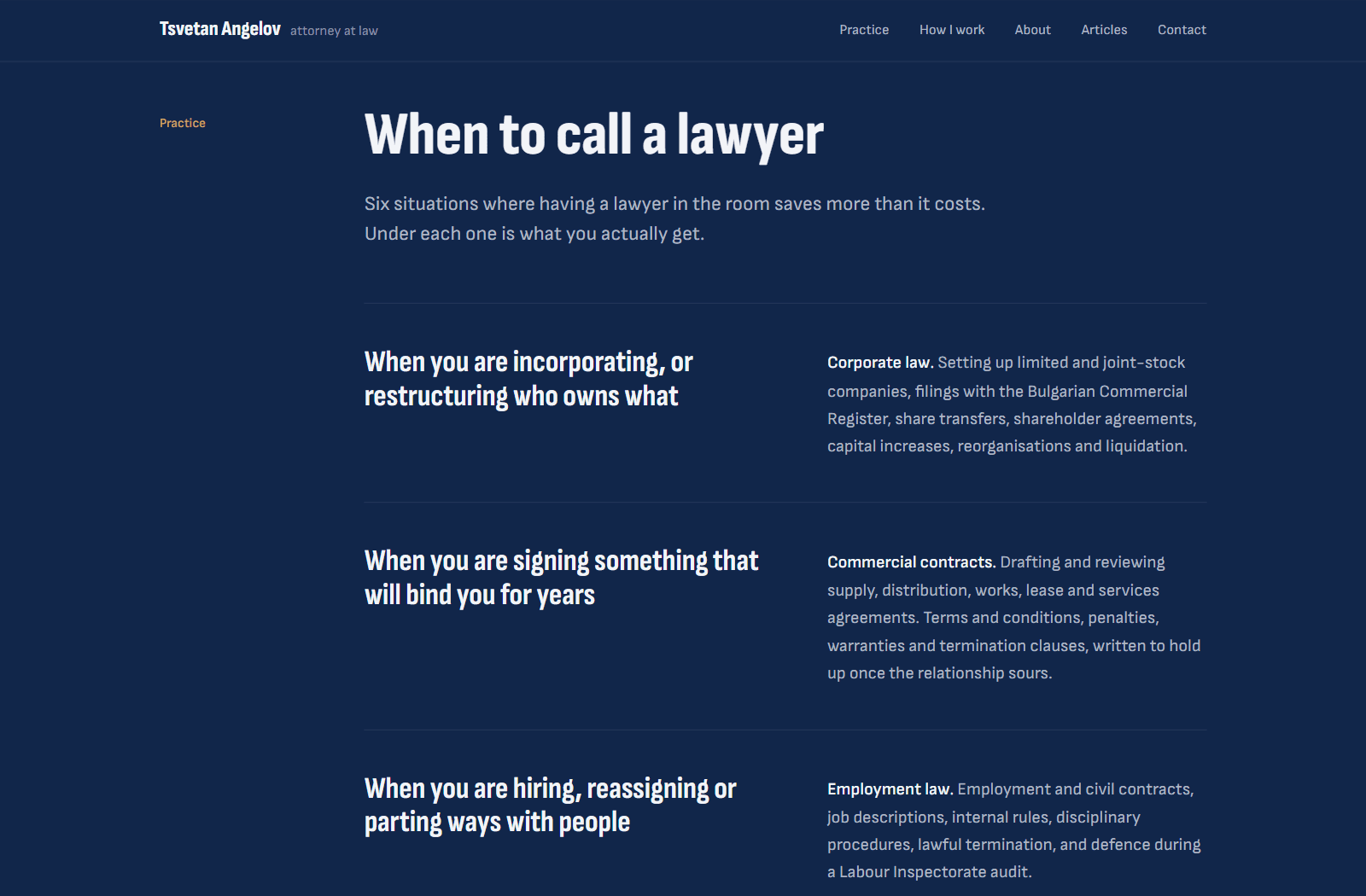
Nobody wakes up needing “commercial contracts”. They are about to sign something that will bind them for years, or an audit order has landed on the desk, or a key employee has to go. So the practice is indexed by the moment the client is in, each one set in large type. The legal name for it opens the note beside it in bold, the way a clause opens with its title.
There are six situations, in the order a company meets them: it incorporates, it signs, it hires, it buys or sells, it is audited, and now and then it ends up in court. Each note says what he actually does — the filings, the clauses, the procedure. Under the list is an invitation: describe anything that is not on it, and hear whether it is for him and what it costs.
Then three commitments, set nearly as large as the headings: an answer, not an opinion; a fee agreed up front; one lawyer on the file. Each is a promise about how he works, which he controls, and not about how a case will end, which no lawyer does. That is one of the lines the Bar Act draws, and it is also the difference between a promise and a hope.
We drafted all of the copy in both languages. On a lawyer's site the copy is a professional statement, so the draft is ours and the last word is his: every claim on the page is one he will be held to.
Fig. 01
Six situations, in the order a company meets them, each with what he actually does beside it.Home · Practice
Spread 03
A letter, not a template.
The usual landing page is assembled from software parts: a hero, three cards, a row of icons and, for a lawyer, a gavel somewhere. This one borrows from the paperwork of the profession. Its masthead is a letterhead — his name, his title and five plain links, with the contact one of them, not a button. Under it runs the line every letter carries, with the city and the office hours.
Beside the opening statement, the hero's facts are set as a small table of particulars. Each section's name sits in a narrow margin column beside its content, like a note in the margin of a contract.
The one ornament is a seal, drawn like the round stamp on legal paperwork. His name, title and city run round the ring, with the initials in the middle, and the ring turns once every ninety seconds: slow enough that nobody watches it move. Once the statement has appeared, the seal is pressed into the space its shorter lines leave, tilted the way a real impression lands. It floats on a circular shape, so whatever the headline is edited to say, the words run round it. On a phone, where there is no such space, it closes the hero instead.
Navy is treated as paper, not as a dark mode. Headings are a toned white and running text a grey light enough to read at length. Gold is the only accent: on rules, on focus, on the seal and on one button per screen, and never on the running text. There are no cards, glows, icons or arrows on links. The commitments and the contact form sit on full-width darker bands that give the page its rhythm. A policy or an article sent to a printer comes out as what it is — a plain black-on-white document, without the site around it.
Fig. 02
The seal pressed into the space the statement's shorter lines leave, tilted the way a real impression lands. Whatever the headline is edited to say, the words run round it.Home · en
Spread 04
Bulgarian, in Bulgarian letters.
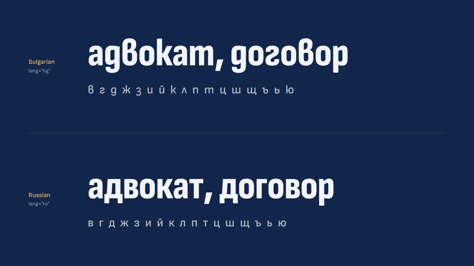
Bulgarian letterforms draw в, д, ж, л and т — and a dozen other letters — differently from their Russian counterparts. Most typefaces default to the Russian forms, and the few that carry Bulgarian ones keep them behind a language setting that common tools such as Figma ignore. The result is a Bulgarian page set in another language's letterforms.
The site is set in Sofia Sans, which Lettersoup drew for the city of Sofia as the first extensive type system with Bulgarian in the default Cyrillic positions. We checked the font files the site serves, not the specimen: seventeen of the thirty lowercase letters of the Bulgarian alphabet are drawn the Bulgarian way, and turn Russian only on a page that declares itself Russian. The two faces it replaced had no Bulgarian forms at all.
One family does all the work. Its condensed width, in extra-bold, sets the headlines, and that width is narrow enough for “Компаниите ме търсят” to run the full width of the sheet on one line, from a small phone to a wide screen, without squeezing the letters. The normal width sets everything else. No italic is loaded, so emphasis is always weight.
On a phone, the stylesheet lets running text hyphenate, but only in words of ten letters or more and never leaving fewer than five on either side of the break, which keeps long Bulgarian words from tearing a narrow measure. Quotation marks follow the language of the page: „…“ in Bulgarian, “…” in English.
To a search engine the two languages are two sets of pages. Every address carries its language, and each page names its translation and points at the Bulgarian one as the default. The bare domain always opens in Bulgarian, whatever the visitor's browser is set to, because a Bulgarian on an English-language laptop is still a Bulgarian. All 301 strings, from the hero to the panel and the e-mails, exist in both catalogues, key for key.
Fig. 03
The same two words — адвокат, attorney, and договор, contract — in the fonts the site serves, declared Bulgarian above and Russian below. Seventeen lowercase letters change shape.Sofia Sans
Spread 05
Measured, in both languages.
The palette came from the client. It was green in the first version, finished a week after the first commit, and has been navy and gold since. Navy is unkind to grey type, and the palette's own dim grey measures under 2:1 against it, so that grey is not used. Running text is a lighter grey that measures 7.3:1 on the main ground and 8.7:1 on the darker bands, past the 7:1 that the strictest level of the guidelines asks for. Even the smallest metadata clears 4.5:1 on both.
Form fields are drawn as a rule under the value, as on a printed form; on both grounds the rule clears the 3:1 a control's outline needs, and it turns gold when the field has focus. Links and buttons keep a visible gold focus ring. The first stop for a keyboard is a link that skips straight to the content, and the phone menu is opened by the word itself — Menu in English, Меню in Bulgarian — not by an icon a visitor has to interpret. The only animations are the hero's entrance and the turning seal, and both stop for anyone who has asked their system for less motion.
Then we measured. Lighthouse, run against the production build of the home page in both languages, scores accessibility, best practices and search-engine readiness at a hundred each, on a desktop and on a simulated slow phone. Desktop performance is a hundred too, with the largest paint at seven tenths of a second and a cumulative layout shift of zero. On the slow phone, performance is 91 in Bulgarian and 93 in English, with the largest paint just over three seconds. It is the only category short of a hundred, so it is reported here and kept off the tiles.
A visit makes no request to anyone else's server: no analytics, no fonts fetched from a third party, no captcha. Nothing on the page tracks the visitor, so there is no cookie banner in front of the first sentence. Every response carries security headers that pin the site to HTTPS and keep it out of other sites' frames.
Spread 06
The form is the point.
Everything above exists to get a company to describe its problem in a few lines. The form asks for what a first answer needs: a name, an e-mail address and the situation, with phone, company and subject optional. Before anyone types, it says that what they write is confidential from the first contact, whether or not they go on to work together. The browser and the server check every field against the same schema, so what the page complains about and what it enforces cannot drift apart.
Every enquiry is written to the database before any e-mail is sent, the same order we keep on our own site, so an e-mail provider having a bad day cannot cost him an enquiry. Then two messages go out. He gets a notification with the sender as the reply-to address, so Reply just works, and a link that opens that enquiry in the panel. The sender gets a confirmation in the language they wrote in, which says plainly that an enquiry is neither an engagement nor advice. Spam is turned away without a captcha, by a hidden field and a per-address limit, so there is no third-party script on the form and nothing extra to disclose in the privacy policy.
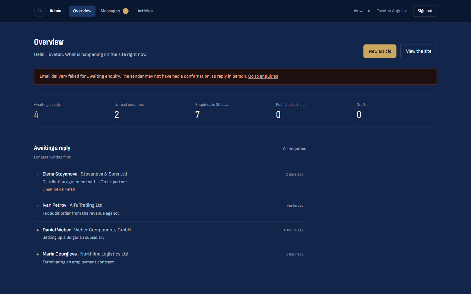
Behind the form sits the enquiry desk, the part of his admin panel built around that one-working-day reply. Its front page lists the people still waiting for an answer, longest first. It warns in red when an e-mail about one of them failed to send, because that sender may never have had a confirmation and needs a personal reply. Each enquiry moves from new to read to replied to archived, carries a private note that never leaves the panel, and shows the sender's earlier enquiries, so a returning client is recognised instead of re-introduced.
Sign-in is Google only, for a short allowlist that is checked again on every request: there is no site password to phish or leak, and removing an address locks it out at once. For a few weeks the panel could also edit every sentence on the site, and we took that out again. His time in the panel goes to enquiries and articles, a change of wording comes to us and passes the same checks as the code, and no page has to ask the database for its words any more.
Fig. 04
The enquiry desk's front page, shown with demonstration enquiries: who is still waiting for a reply, longest first, and a warning when an e-mail failed and the sender needs a personal answer.Enquiry desk · Overview
Spread 07
Where it stands.
The site is built in both languages and goes live once he has signed off the copy and confirmed the practice details. Until a detail is confirmed, the page simply leaves it out: no invented number, nothing a visitor could mistake for the real thing.
A regulated profession can say less about itself than a shop can, and this one says it in two languages. That makes the site smaller, never simpler: every sentence on it is one somebody answers for. It is a brief worth taking carefully, and this time we took it for the lawyer we call when we need one.