A studio site is a landing page with a job to do: say who we are, and start the right conversations. Nothing about it is hard, which is exactly why it is worth doing properly — a written design guide, one layout that holds on any screen, a keyboard and screen-reader pass, and no page a server has to build.
100
Lighthouse SEO
96
Lighthouse accessibility
98
Lighthouse performance, desktop
102 kB
JavaScript shared by every page
Sector
Professional services · Marketing site & back office
Location
Sofia, Bulgaria
Duration
4 weeks of build · ongoing
Engagement
Custom Platform
Listen to this case study
0:00 / 11:41
Narrated by A I from the text of this page
Spread 01
A small site, with nowhere to hide.
Most of our work comes through referrals. When a referral lands here, the site should confirm what they were told: a small senior team that ships real platforms and thinks before it builds. The previous one said we “empower businesses with custom interactive web platforms”, listed thirty technology logos and offered a contact form. It could have belonged to any agency in Europe.
This is not a hard build, and we are not going to pretend otherwise. A studio site is a handful of pages, some writing and a form. What it has instead of difficulty is nowhere to hide. There is no feature to admire past the seam — the misaligned rule, the focus ring somebody deleted for looking untidy, the layout that folds on a narrow phone, the headline that reflows to leave one word alone. That is the whole impression, and it forms before anyone reads a sentence.
So the brief was short. Show the work, with figures that come from somewhere. Explain how an engagement runs, step by step, so nobody has to guess. Ask on the page the questions we would otherwise ask on a first call. And hold all of it to the standard we would hold a client's landing page to — because a studio that cuts corners on its own site has told you something.
Spread 02
The design guide came first.
Nothing here was styled as it came up. Three typefaces do all the work: Fraunces for display, held at a light weight with its optical-size and softness axes pinned so headlines stay warm rather than brittle; Bricolage Grotesque for reading; JetBrains Mono for the small uppercase labels that number the sections. All three are self-hosted at build time through next/font, so a visitor's browser never calls out for a font and the page never reflows when one lands.
The palette is one indigo, four accents — yellow, orange, pink, lilac — and three warm paper tones, with a fractal-noise texture multiplied over the page so the off-white reads as paper instead of as grey. Twenty-seven tokens, one corner radius, two shadows. Every colour on the site is one of them, and a twenty-eighth is a decision somebody has to argue for.
On top sit the editorial primitives the pages compose from: hairline and double rules, the thin spine down the edge of a page, halftone dots, diagonal pinstripes, a marker highlight skewed behind a word, a wax stamp, an underline that draws itself on hover. Fifty-two named classes in a single five-hundred-line stylesheet — no component library, no theme to override, nothing installed that then has to be styled back out again.
Spread 03
One layout, every screen.
The layout is written small first and grown: two hundred and seventy-six rules at the small breakpoint, a hundred and forty at medium, a hundred and thirteen at large. Nothing was designed at desktop width and squeezed afterwards, which is the usual reason a phone ends up with the leftovers.
Then the details that only appear on a real device. Fields render at sixteen pixels below the small breakpoint, because anything smaller makes iOS zoom the page the moment a finger lands in one. Links and buttons carry touch-action: manipulation, which drops the browser's wait for a possible second tap. The mobile menu pads itself clear of the home indicator with env(safe-area-inset-bottom). The body clips horizontal overflow, so one element that overshoots can never push the whole page sideways — the failure every phone visitor has met and none of them report.
Type is held to the same care. Headings set text-wrap: balance and body copy text-wrap: pretty, so a line does not break to strand a single word. An anchored link scrolls its heading to six rems below the top, so the fixed navigation never covers the thing you clicked to read.
Spread 04
Built for how people actually read it.
A skip link is the first thing in the document and the first thing a keyboard reaches. Every link, button and field keeps its :focus-visible outline — two pixels of accent yellow, held two pixels clear of the element — and not one was removed for looking untidy, because that ring is the only thing telling a keyboard user where they are.
The forms answer back. A confirmation is announced politely and a failure assertively, through live regions that exist for the purpose, and each invalid field is wired to its own message so a screen reader reads the problem with the input rather than somewhere above it. Seventeen distinct accessibility attributes, two hundred and seventy-nine uses across the site, none of them papering over the wrong element.
Motion is a preference, not a decision we made on your behalf. Every animated component reads the operating system's reduced-motion setting and drops its offsets when it is on, and the stylesheet independently stops the ticker tapes, the blinking caret and smooth scrolling. When something does go wrong, a visitor gets a sentence a person wrote; the stack trace goes to the log, where it is useful.
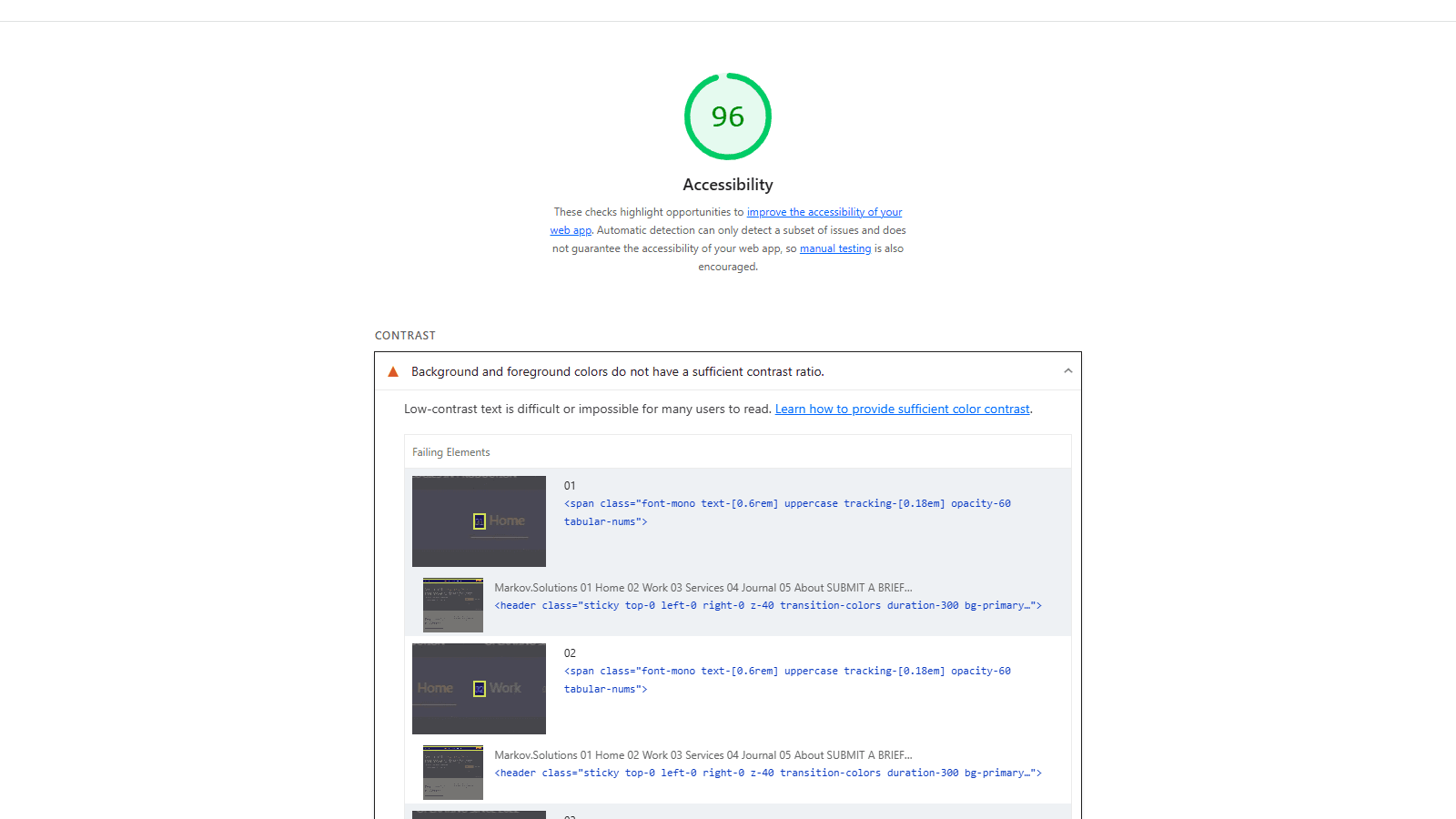
An audit of the production build scores the accessibility at ninety-six, and we would rather print that than round it up. The missing points are all one finding: contrast on the smallest mono labels and the faded index numerals, where the accent colours and the lighter indigo sit paler on paper than the standard allows. It is on the list. In September there were two; the link whose accessible name left out its own visible text has since been fixed. A page that claimed a hundred would be a page nobody had measured.
Fig. 01
Ninety-six, in the tool's own words — the points it withheld are listed here, not rounded away.Lighthouse
Spread 05
Fast because there is nothing to be slow.
There is no content system. Services, case studies and journal entries are typed data in the repository, edited in a merge request like any other code — and the suite fails if an entry breaks its own rules: a closing paragraph that smuggles a figure back in, a metric too long for its tile, a link that would send a reader to a tool meant for staff. More than a thousand tests run on every push, alongside the type check, the lint and a full build.
Every public page is rendered at build time and served from a CDN — more than sixty outputs, counting the social cards and the sitemap, a hundred and two kilobytes of JavaScript shared by all of them and two hundred and seven on the heaviest. No page waits on the database to render: the contact form, the quizzes, the newsletter, the view counter and the site assistant reach it through API routes once the page has loaded. There is no server to keep healthy, and the running cost of the public site is close to nothing, which was a requirement rather than a happy accident.
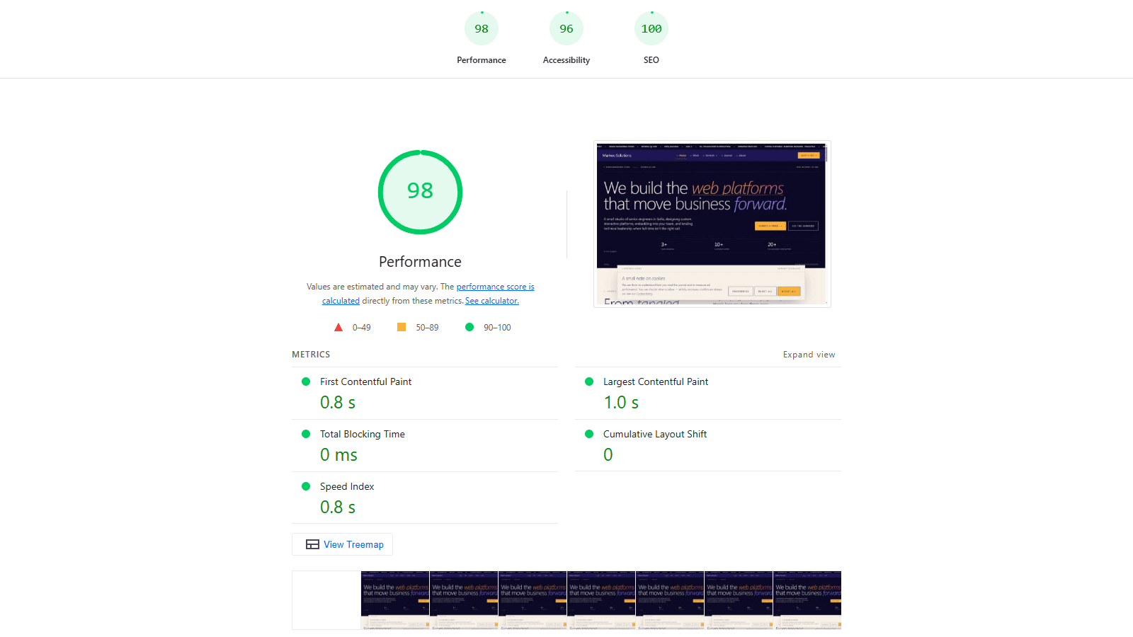
Measured rather than asserted: an audit of that build returns a hundred for search-engine readiness and ninety-eight for desktop performance, with a first paint in eight tenths of a second, nothing blocking the main thread and a layout that does not shift at all while it loads. Throttled to a slow mobile connection against a local server, with no edge cache in front of it, the performance figure drops to sixty-five — which measures the test bench as much as the site, so it is not a number we will put on a tile.
The build enforces its own preconditions. Every environment variable is validated before anything compiles, so a missing secret fails the build instead of the site. Writing this paragraph we ran a production build in a fresh checkout with no environment file, and it stopped before compiling a line, naming the five variables it wanted. That is the right place to find out.
Fig. 02
The figures in the tiles above, from the tool that produced them.Lighthouse
Spread 06
A landing page with a job to do.
Looking right is half of it. Every service page ends in a brief: a two-minute quiz that plays the engagement out for the visitor's own case — which decision is on their desk, what already exists, who signs off, what the timeline looks like. Follow-up questions appear only when an earlier answer makes them relevant, so it reads as a conversation rather than a form. Three quizzes, forty questions between them.
Answers are saved as they are given, so an abandoned quiz still tells us what someone came looking for. A finished one lands in the admin with a status, an owner and notes, and the first call starts from their answers instead of from zero. Contact messages are stored before any e-mail goes out, so a mail failure never loses an enquiry, and the newsletter is double opt-in with a single-use link — nothing is ever sent to an address that has not clicked it.
For visitors not ready to talk, the Journal and the newsletter keep the door open, and the SEO desk in the admin — a smaller version of the one we built for StyleClimate — shows which searches bring people here and where we rank for them. Same instinct as the rest of the site: measure the thing rather than assume it.
Spread 07
The details nobody asks for.
Before the domain pointed here we ran the launch punch list we would run for a client, and it found twenty-one things. Every page now generates its own Open Graph card instead of inheriting the homepage's, so a shared link shows what was actually shared. Canonicals throughout. Structured data for the studio, the site and every article. The homepage redirect made permanent rather than temporary, and real dates in the sitemap instead of the date of the last deploy.
Then the unglamorous half: a full set of security headers on every response, the three public forms behind a rate limit that holds across serverless instances, a honeypot and Turnstile, raw error text in front of a visitor replaced by a sentence a person wrote, remote schema changes moved onto reviewable migrations, and the staging deployment kept out of the index so it can never compete with the live site. Twenty-one found, twenty-one closed.
The same audit wrote down what was already right — the authorization, the secrets, the consent handling, the accessibility work above — because a list of only faults tells you nothing about where not to spend the afternoon. We keep both halves. It is the document we would hand a client, which is rather the point of running it on ourselves first.
Spread 08
Where it stands.
You are reading it. Nearly all of this case study needs no screenshot, because the case study is the page — resize the window and watch the grid change its mind, tab through it and watch the focus ring keep up, turn on reduced motion and watch the movement stop. The two screenshots above are the exception: a score is the one thing a live page cannot show you just by looking at it.
None of it is difficult. It is simply done. If you need a landing page that works on whatever device turns up, for whoever turns up, that is a small job, and we would rather do it properly than quickly. Every claim above can be checked against the page you are on.